GoTo Rebrand Site Launch and Design System
Description
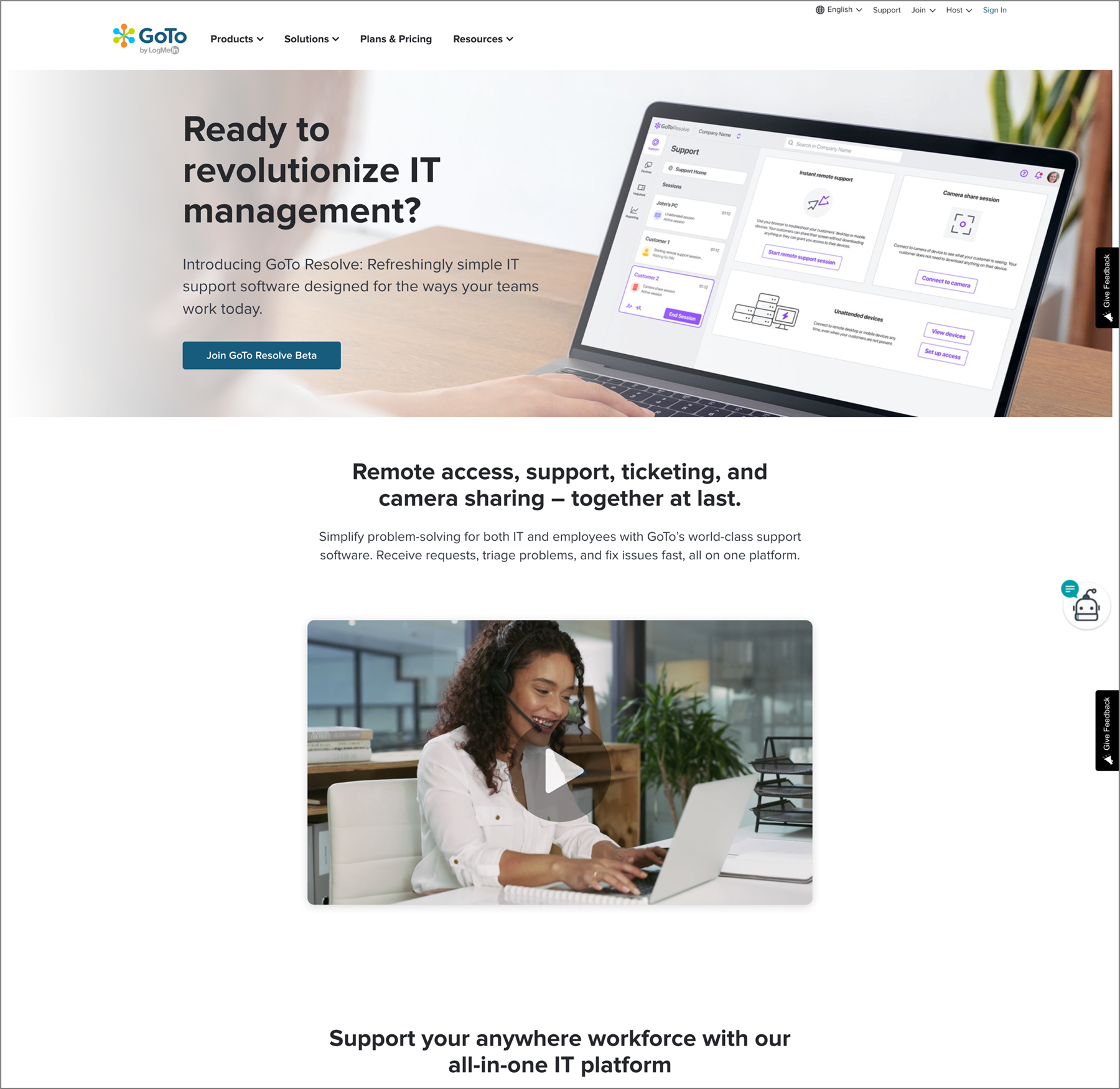
On February 2, 2022 LogMeIn officially rebranded as GoTo. As part of a large scrum “tiger team,” several other designers and I were tasked with designing the all new GoTo site from the ground up. My roles included assisting with the development of a new design system and component library that aligned with the company rebrand, developing page templates for features and solutions pages, and building out PDP pages to launch two new products: GoTo Resolve and GoTo Contact Center. Post launch I worked closely with a team of two other designers to re-organize and maintain the design system, ensuring scalability and alignment with the live site as well as setting up workflows and consistent processes to use across scrum teams.
Role
UX
UI
Visual Design
Design System
The GoTo website design system is managed collaboratively as a team and used by several scrum teams to build and maintain pages on the eComm site. As an atomic design system, there are foundational elements that build up to atoms, then molecules and finally components. Elements of the system are constantly being tweaked and added to based on content and optimization needs. Another important part of the system is the graphics library which allows access to source files in a single location in Figma, helping maintain consistent image formatting across the site.
PDP Pages
As part of the site launch new product detail pages (PDPs) were created for new product offerings. These pages had to align with other existing PDP pages while also highlighting the features and value prop for the new products. Additionally, GoTo Connect would not have it’s own pricing page so the ability to purchase the product needed to live on its PDP page.


